7 Ways to Conquer Your Fear of Color
Whether you want orange in the entry or blue in the bathroom, here are some of our best tips to brighten your home.
1. Start Small
If you're afraid to go bold, try starting in the smallest room. It's not as much of a commitment, plus you'll spend less time and money. This tiny - but cheery - bath in a New Jersey home makes a strong statement. "Powder rooms are places where you can gild the lily. We used a loud geometric in a bright ocean blue to give it a slightly over-the-top feeling," says designer Mona Ross Berman. Wallpaper is Recessed from Studio Printworks.
Plus, see: 11 Essential Organizing Tips for Small Spaces
2. Temper Hot Colors With Cool Ones
Because orange can be too intense on its own, Berman added blue accents in the mudroom. "It's such a welcoming color. Orange feels like a younger, fresher version of red," she says. "But it can be a hot color, and I needed a little bit of cool as balance, to cut through the heat." Wall color is Benjamin Moore's Fresno.
Also: Tour a Daring, Dramatic, and Colorful Family Home
3. Balance Glossy and Matte Surfaces
In this Beverly Hills living room, designer Martyn Lawrence Bullard choose Jean de Merry slipper chairs in Schumacher Sargent Blush silk taffeta. "Silk enriches every hue," he says. For every glittering color, however, there has to be a matte one to offset it: "You must balance the ethereal with the earth."
See More: 20 Decorating Secrets
4. It's Okay to Mismatch
For the kitchen of a Missouri lake house, designer Rhoda Burley Payne's client choose a pistachio Aga range. Unsure what to do with the cabinets, Payne decided to paint them in a similar color. "We did them in a green that blended, but didn't match." Subtle differences in hues make for a more sophisticated palette. The cabinets are in Benjamin Moore's Everglades, thinned to a stain so that the grain of the pine shows through. Wall tiles are by Flores Grandes.
See More: 101 Easy Home Makeover Ideas
5. Keep Pink in Check
To create a modern living room for a Capitol Hill row house, designer Barry Dixon choose a pink and brown palette. "It's both masculine and feminine. They set each other off," he says. The dark browns keep the pinks from appearing too frothy. The French Club Chairs are by Niermann Weeks and a Tuscany ottoman is by Stewart Furniture.
See More: Amazing Designer Kitchens
6. Choose One Color, But Use Many Hues
Creating an idyllic bath for a Long Island home, designer DD Allen choose a blue palette but did not limit herself to one shade. The custom watery blue of the polished Venetian plaster walls picks up the blue in the floor tiles. Waterworks Classic Undermount tub. Architecture by Michael Pierce.
See More: Beautiful Designer Bedrooms
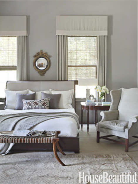
7. Add Contrast to a Neutral Palette
To make the master bedroom of this Alabama home more dynamic, designer Betsy Brown choose bright white bedding and a white lampshade. "A room of creams and beiges needs something stark and shiny white. You have to interject elements that add intense personality," says Brown. Walls are Rockport Gray by Benjamin Moore. Saber Leg ottoman by Formations. Cashmere blanket from Suite Dreams.
Are you afraid to use color in your home? If not, where have you used a bold shade?
More from House Beautiful:
Become a fan of House Beautiful on Facebook and follow us on Twitter and Pinterest!
Want more decorating advice and interior inspiration? Subscribe to House Beautiful and save up to 80%!
