15 Ways to Add Bold Color to Your Home
A Pasadena couple reveals how to live with a daring palette.
The no-fear guide to color
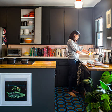
One look at the electric blue and gray hexagonal tile in Jon Leaver and Tyke O'Brien's kitchen, and you wouldn't think they went with the safe choice. But in the couple's 1940s Pasadena bungalow, "safe" is a relative term. "For us, it's a bigger risk to do something boring," says O'Brien.
The whole house reflects that spirit of brio. Inspired by photos of rooms with dark walls, the couple--both teachers who moonlight as interior designers--painted the kitchen cabinets and walls charcoal gray and covered the floor in the colorful geometric tile. Their living room palette? Teal and hot yellow. Even the front door didn't escape without a graphic motif.
To make room for all this color and pattern, the couple left most walls pale gray or white. "Light dove gray is the best canvas to set artwork against," O'Brien says. "We love how color pops against it." When a space has one big gesture, such as the wallpapered accent wall in the master bedroom, they left the other elements neutral for balance.
Their best advice, however, comes from blowing through lots of color experiments that didn't work: Accept that you'll make mistakes, then paint over them.
Sound overwhelming? Start by working with your favorite colors.
Same colors, different ways
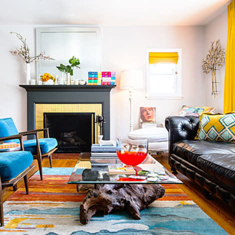
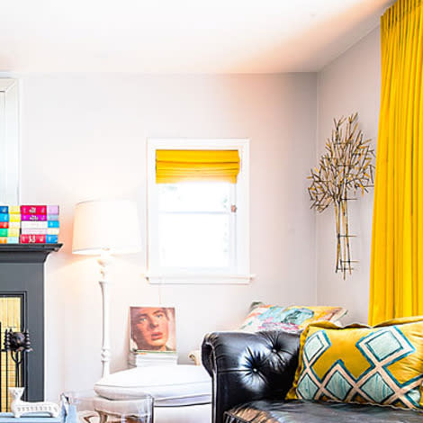
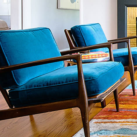
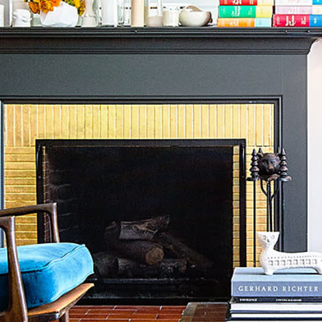
O'Brien and Leaver used many of the same hues in both their kitchen and living room. Here in the living room, teal dominates, while charcoal gives the fireplace more heft. Patches of hot yellow in the rug encouraged the couple to hang curtains in the same shade. "We wanted something bright to complement the rug and the chairs," Leaver says. "It brings out the gold leafing around the fireplace too." Hot yellow and dark teal are complementary colors, so they work well together. Varese Alchemilla and Varese Turquoise fabric, $156/yd.; designersguild.com.
More on redecorating with paint
Set a neutral backdrop
A cool gray paint on the wall--this one has a touch of blue--looks crisp in most lights and serves as a solid base for bolder touches like the yellow elements shown here. Stone RLUL221; ralphlaurenhome.com.
Vibrant seats
Make chairs instantly (and affordably) chic by re-covering them with inexpensive, durable Ikea curtains in a bright color.
Use a mixer
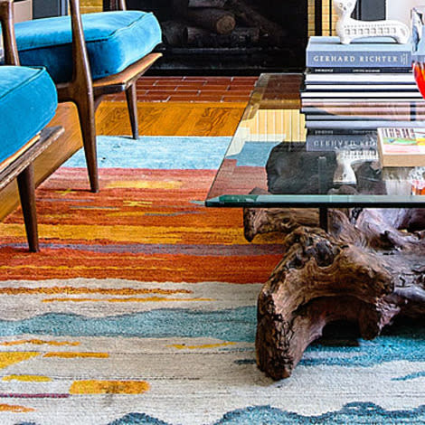
A multicolor piece--a rug is great for this--can tie elements together and add new hues. Luribaft Gabbeh rug, $311; wayfair.com.
Add glitz
Use gold leaf over fireplace brick. Metallics make almost any palette more dynamic. Gold leaf, from $10/18 sheets; michaels.com.
Choose a star
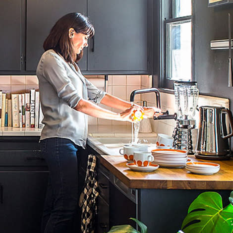
Instead of replacing the unremarkable wood kitchen cabinets, the couple painted them charcoal and added black hardware. By painting the wall and window trim the same color, they put the focus on the floor tile. Moreover, deep charcoal acts as a neutral. Both warm and cool tones pair well with it. Smoked Glass RLUL225; ralphlaurenhome.com.
More home-decorating strategies from the pros

Show-stopping flooring
The hexagonal tile makes the room. Two shades of gray relate the tile to the wall color. The blues add shock value. Hexagon 8 tiles in Original Blue, from about $20/sq. ft.; kismettile.com.
Touch of warmth
Butcher block's natural hues soften the modern tile and dark cabinetry. Hard Rock Maple, 11⁄2-in. edge grain, $32/sq. ft.; johnboos.com.
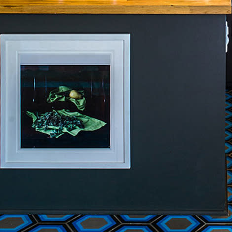
Element of surprise
Hanging art in unexpected places, like on a kitchen island, adds fun dashes of color to a room.

Wild cards
Small doses of orange (think serving ware) and lush greenery (a leafy house plant works well) shake up the blue/gray palette. Sunrise Sunset ceramic bowl, from $50; etsy.com/shop/markcampbellceramics.
More on adding flair by using surprisingly affordable centerpieces
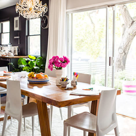
Balance dark with light
Every yin needs a yang, and the dining room's white palette tempers the kitchen's strong one. Wood grain on the teak table and butcher block countertops unify the spaces.

Color the tabletop
In a largely-white room, small pops of color make a difference. Here, cherry-red trim on dishes and color-coordinated linens add cheer.

Accent with pattern
Although O'Brien loved the Vivienne Westwood tartan wallpaper from Cole & Son, she knew she'd have to use it strategically to prevent it from being visually overwhelming. She hung it on the bed wall (eliminating the need for a headboard), and painted the rest of the room white and gray. White bedding doesn't compete for attention.

Freestyle the front door
Leaver gave a former student a challenge: Look at the house, then paint the front door however you think looks best. The result--graphic shapes on both sides--nods to the home's midcentury lines.
More on making retro work for you
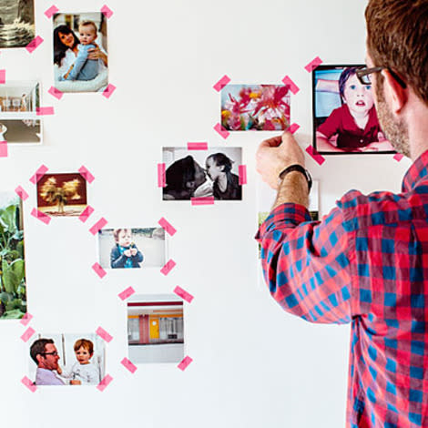
Think outside the frame
Hang family snapshots with neon rice paper tape. It's a playful yet tasteful way to add yet more colorful touches.
More outside-the-box ideas
