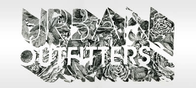
Generic new Urban Outfitters logo: another Gap-style publicity move?

This week, retailer Urban Outfitters unveiled a new orange logo, scheduled to roll out right before the busy holiday shopping season. And while we've had a hard time remembering what its old logo looked like (which doesn't bode well for its design, right?), this new golden-arching iteration is more than a bit odd, and even pretty terrible. We also wonder if this dramatic change is a calculated publicity move a la the recent Gap Logo-gate, since it's yielding tons of internet chatter and trending on Twitter.

We understand-Urban Outfitters is a trendy store that likes to change with the times. Styles come and go from season to season and UO needs to appear modern and on-trend. To that end, its retail locations remodel three to four times a year with different "floor sets" that change the whole look of the store, and the company often shifts its logo designs at these times. As for the logos themselves, they're all over the place, with a wild variety of fonts, characters, colors, and graphics, and often aren't even consistent across the company. At any given time, UO's shopping bags, storefronts, catalogs, and website may all display an entirely different logo. That new orange version? It's not the one on their brand new, reusable shopping bags, which are actually black and white. One could argue this adds a sense of uniqueness to the brand, but we wonder if Urban Outfitters would benefit from sticking with one creative, identifiable logo for a greater length of time. Anthropologie, a chain owned by Urban Outfitters Inc., has a clear aesthetic and has maintained their logo for nearly a decade, but UO seems to deliberately lack consistency.
Logos are considered a vital part of branding because consumers recognize them and, over time, begin to make familiar, trusting associations which them make a person more likely to buy from a particular company (for example, we see the McDonald's golden arch and we can practically smell the fries. We see the red Coca-Cola logo and we crave a soda.)
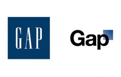
Urban Outfitters isn't the only retail giant to recently rally against this conventional logo wisdom and pull a switcheroo. Last month, the Gap unveiled a new logo which looked generic and corporate and, perhaps worst of all, failed to conjure the positive associations their iconic blue logo has for the past 20 years. Reps for the chain said on Facebook that the logo was part of a crowd sourcing project, and even asked for other ideas, but supposedly due to negative feedback they decided to bring bag the old logo. Yay! The people win! Or was the entire enterprise, as some have speculated, part of a big publicity stunt to garner attention for a fading brand?

In late 2008, Tropicana also tried a new design, ditching the straw-in-the-orange image that made the juice famous. The new, more basic design was objectively more modern, but it left consumers feeling flat. By early 2009 Tropicana brought back their old design, just as the Gap did. Most of the time, consumers don't react well to change, especially when they feel the new logo doesn't represent their trusted brand well enough. Perhaps companies would benefit more by staying consistent with a tried-and-true logo, than trying to reinvent themselves. We say: If it ain't broke, don't fix it.
Do you think it's important for companies to stay with the times and constantly change up their look, or do prefer when a brand sticks with a familiar logo?
